
And the recipients are…
Nashville, TN – The Tennessee Chapter of the American Institute of Architects (AIA Tennessee) celebrated the 2020 Design Awards during the AIA Tennessee’s Celebration of Architecture held on Friday, September 11. To salute excellence in architecture, AIA Tennessee conducts an annual Design Awards program. This program honors built works of distinction designed by AIA Tennessee members, and brings to public attention their outstanding architectural accomplishments.
Matthew Schottelkotte, AIA, LEED AP, of GBBN, led the jury composed of the following architects from Ohio; Katie Conner, AIA, President and founding partner of Arcx Studio, a collaborative design practice in Cincinnatil; Terry Boling, AIA, LEED AP, a practitioner, builder and educator; Lauren Whitehurst, designer and adjunct instructor at the University of Cincinnati’s School of Architecture and Interior Design;
The fourteen (14) projects were unanimously chosen as design award recipients. The jurors noted the diverse range of work and elegant solutions to challenges presented. The jury comments for the awarded projects are shown below:
Award of Excellence
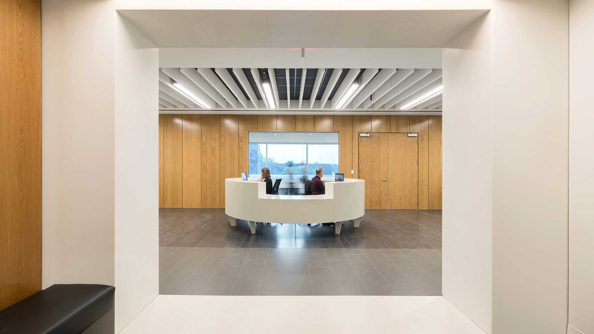
JAMES D. EASON TRANSPLANT INSTITUTE AT METHODIST UNIVERSITY HOSPITAL | archimania


Interior Architecture
The program statement put forth “the institute challenges a medical industry that is overly prescriptive and generally lacks the vision to be modern.” This project succeeded at challenging and meeting this goal. The design has a sense of preciseness, and an appreciation for subtlety that models the quality of care someone might receive at this facility. The detailing of floors, walls and ceilings leave no surface unconsidered. The corridor outside of the patient and caregiver rooms, thith their frosted glass walls and wood paneled seating niches proves that an unapologetic modern design can consider human needs.
CHRISTIAN BROTHERS UNIVERSITY CROSSTOWN | archimania


Interior Architecture
Honest and refreshing in its design language. The project has good energy throughout the spaces from the community lounge, along the ribbon and into the break room or learning lab. For such a small space there are so many differentiated spaces starting at the primary entrance from the fourth floor corridor, which makes the corridor feel part of the spacing by creating a front porch. The final feature that stood out to the jury was the effective use of natural light. The reflective quality of the learning lab and the portal windows through the office lets someone sitting in the community lounge see daylight.
IDLEWILD EDUCATION BUILDING AND ENTRYWAY EXPANSION | brg3s


Renovation and Restoration
The jury really liked the deft way the architect converted the entrance into an accessible entry in a manner that elevated the original building. The architectural language is at once its own, but in no way detracts from the historic neo-gothic building. From the razor thin canopy, to the butt-glazed arcade and the board-formed concrete work – the new pieces emit a compatible language that lets the old be old and new be new. We imagined that everyone entering the building understands that this institution values its past, yet appreciates the need to be future focused.
225 POLK AVENUE | HASTINGS ARCHITECTURE


Renovation and Restoration
The jury felt the designers did an excellent job playing off of the quality of the existing building without sacrificing their own design voice. We appreciated how the new space capitalizes on the raw interior space in a way that clearly transforms the building. We felt the designers were able to take advantage of the scale of the interior spaces to elevate the quality of the new rooms. We liked how the renovation brought the beautiful existing structure forward celebrating it in a way probably not considered by the original architects.
TOBIAS RESIDENCE | archimania


Renovation and Restoration
We have to admit this project brought some joy to the jury. We felt this project was a bit like a white elephant gift – the one you pick up, un-wrap and discover you just got something special. This project is not just a one liner of a modern insertion in an old building. The interior craft is equal to that of the historic house – yet in a modern voice. We were captivated by the “other-worldliness” of the attic transformation. The rigor of the detailing, the ethereal quality of the spaces and the richness created through the simple material palette made this a magical space. We chuckled as we imagined the joy the owner must have stepping in and out of these two worlds.
DOMINION GROUP | SANDERS PACE


New Construction
This project really succeeded at all levels for the jury. It made maximum use of a small site without compromising the buildings strong massing or the exterior spaces. It’s super clean and well planned. The site, building and interiors were holistically considered helping to give the building greater presence. The designers should be commended for their high level of exquisite detailing throughout the project. This project stood out as a building we all would enjoy working in everyday.
ORION FEDERAL CREDIT UNION – POPLAR | archimania


New Construction
The diagram for this project set the tone for a humble building having a big impact. The integration of the site, the building and the interior into one, cohesive design helped this project stand out from other submissions. The conversion of the site from a gas station to a bank positively transformed the corner site. The design intent of openness, hospitality and community were achieved through a simple building mass, expansive glass facades and well-proportioned interior spaces.
CIVITAS | archimania


New Construction
LEED platinum – congratulations. While we did not eliminate any project for not having a strong statement about sustainability – we are very appreciative of this projects commitment to the environment – good luck on becoming certified zero energy/zero carbon. The juxtaposition of this modern house to its more traditional neighbors created a wonderful dialogue about what it means to be a home. Even being the bold. Modern insertion that it is – it shows respect to its context by employing elements of the historical neighbors like the porch, courtyards and its subtle plinth. The interiors balance between human scale and grandeur with the floor to ceiling windows creating a seamless connection to outdoor spaces. The simple palette of materials give the house – inside and out – an elegance that fits the neighborhood.
FRONTLINE TOWNHOMES | archimania


New Construction
Unapologetic – simple – high quality at a modest budget. These were some of the descriptors that immediately came to mind when reviewing this project. The project delivered big time on elevating the gritty, post-industrial area in an empathetic, not elitist way. The texture of the building provides visual appeal at a range of scales. The buildings create a strong street edge without compromising the privacy of the first floor entries and then creates really interesting exterior private spaces between the building blocks.
Awards of Merit
NASHVILLE RANCH RENOVATION | MICHAEL GOOREVICH ARCHITECT + MANUEL ZEITLIN ARCHITECTS


Renovation and Restoration
The interior of this house went through a tremendous transformation – from a generic suburban ranch into a light-filled, clean modern house. The high sense of craft is seen throughout the interior from the new window seats, to concealed cabinetry, to the tight minimalist kitchen island. We were truly impressed with the sophistication of the interior spaces.
THE BUNTIN GROUP | HASTINGS ARCHITECTURE


Renovation and Restoration
Sometimes restraint can be the best course of action – this is what the jury appreciated about this project. There are so many good existing features to build from in this building starting with the clean simple exterior, to celebrating the interior scale and the elegant existing structure. The new insertions added to and played off of the existing elements in a rewarding way. We felt the new elements don’t disappear, but they also don’t shout too loud. The end result is a project that retains the spirit of the past without becoming lost in nostalgia and creates a new spirit to carry it into the future.
ECLIPSE RESIDENCE | curb
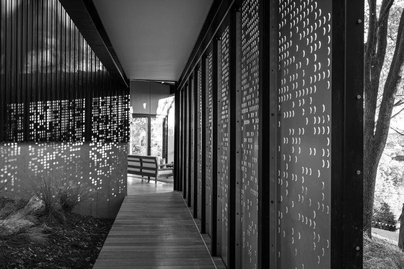
New Construction
The siting of the house created a nice play between the built structure and the landscape. The detailing of the screens was particularly strong – creating separation of space and creating interesting and changing patterns of light. We felt the entry sequence very well choreographed – from the driveway, to the garage, to moving into the house and through the house. The quality of detail was excellent throughout the house. So many different places to enjoy views of the surrounding landscape.
UP HEALTH SYSTEM – MARQUETTE | GRESHAM SMITH


New Construction
Big buildings being judged against smaller buildings is always a challenge in an award program. Being a healthcare building can make it even harder. We felt this building held up to the challenge. Its effort to respond to the site, its sensitivity to the exterior massing and the attention to the quality of interior space were consistently strong. We appreciated the story that was told through this project, we congratulate the designers for breaking from the standard typologies of healthcare projects. The exterior façade was well composed, breaking the scale down to try and relate to its surroundings – yet avoiding it from becoming too complicated or fussy. The material selection and color palette helped the building connect to the site.
RESIDENCE GUTIERREZ | archimania


New Construction
The party house. Nice clarity of plan. Landscape and courtyards create a strong sense of privacy on a tight site. “The wall” creates a datum for the house that gives it presence and privacy. We appreciated the way nature was incorporated into the interior experience of the home. Overall, we appreciated that the home was well designed but retained its domestic scale.